My Exploration of Color in Acrylic Painting
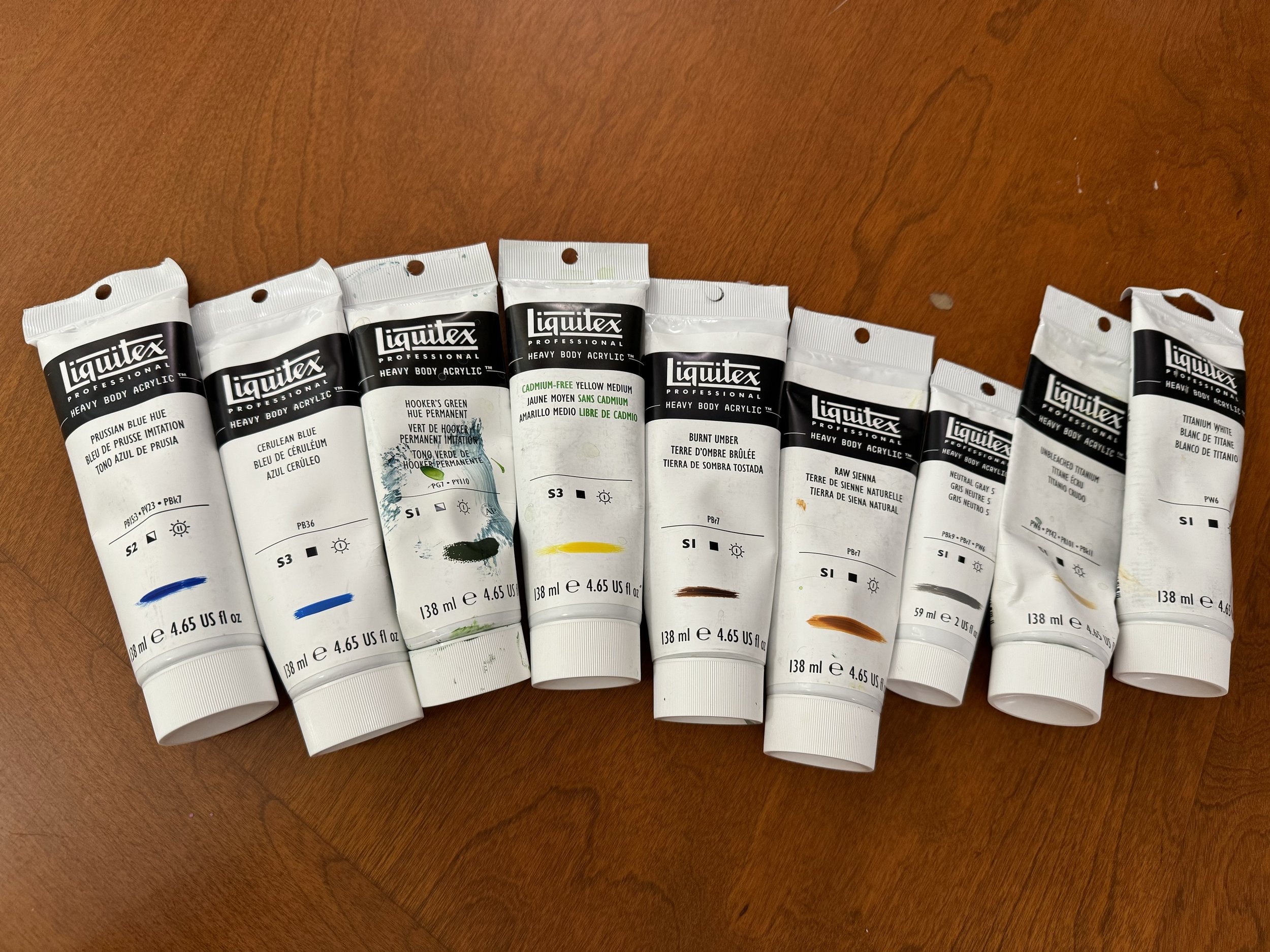
As a fine artist, color is at the heart of my work. I am currently exploring a vibrant palette of heavy body acrylic paints. Each of these colors has been thoughtfully selected for its unique properties and the way it contributes to the overall expression of my art.
Prussian Blue Hue provides a rich, deep tone that creates depth and intensity.
Cerulean Blue introduces a refreshing, airy quality, with a sense of calm and tranquility to the canvas, balancing the more intense hues.
Hooker’s Green Hue Permanent adds a touch of natural vibrancy that represents growth and renewal and is ideal for rendering foliage and landscapes.
Cadmium-Free Yellow Medium offers a bright, bold burst of energy and brings warmth and luminosity.
Burnt Umber and Raw Sienna are earthy tones that ground my paintings with depth and warmth.
Neutral Gray 5 serves as a balancing color, to soften transitions between hues and unify the palette.
Unbleached Titanium offers a warm, off-white tone that softens the overall palette by adding a vintage, rustic feel.
Titanium White is essential for creating highlights and lightening other colors. Its opacity and brightness bring clarity and contrast.
